Fashioning Architecture Weighs in on Brand as Place

This is the first guest post on my blog. Recently, you might have noticed my series on the branding of spaces and places. I thought it fitting to have the perspective of a student of space weigh in here and offer some insights from someone less obsessed with the graphic articulation of complexity and more obsessed with the origins of much of that complexity. I have long been a fan of architecture, but still have much to learn. Thank you to Miss Bozzi over at fashioning architecture for her myriad perspectives and for being a constant source of inspiration. I hope to publish many more of our long evening discussions in the future as I find they keep me grounded and help me to find a balance. Enjoy and thanks again!

When Foster first started this branding series, I was inspired. And then he asked me to write a guest post about branding, specifically branding of cities/countries, from an architectural perspective, and I was honored.

Right off the bat without much research into the topic, I really question if architecture can be branding? Does architecture need to be branded? Why do we need logos and typefaces for cities if the space can brand itself?

But then on the other hand, ‘architectural branding’ has become the new buzzword of the architectural industry in the last decades and rightfully so, since architecture becomes an expression of the newly developed experiential brands. Despite our increasingly virtual world, we still need physical buildings to establish personal relationships with brands and architecture plays a vital role in this equation by not only confining customer experience, but defining it, which is more than any brand can do. I really question the ideology that architectural branding adds significant value. And I am still waiting for a good reason for why architecture itself can’t brand the cities.

Take a look at skylines. I think that you could probably guess which planning committees in the United States use their skyline as a branding form. In some cases the city skyline is a brand. When I look at the silhouette of Seattle, I know right away, “oh hey, that’s the space needle!”  And when I see the Washington Monument peering up, I immediately think “oh hey, that is Washington D.C.!” The proof is in the pudding and the postcards.
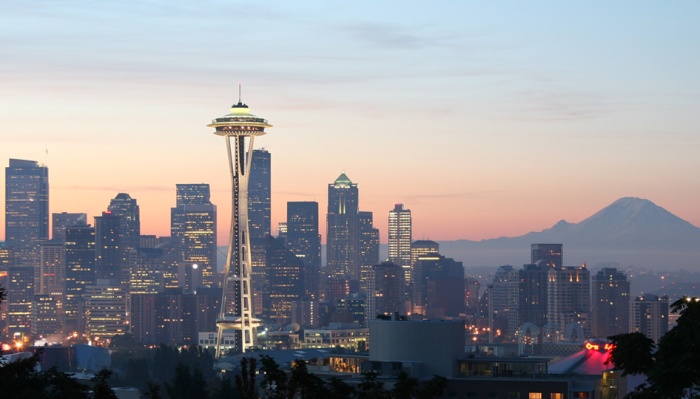
Seattle
Iconic Space Needle in Seattle
The District's Obelisk
The District of Columbia’s Obelisk

To be more critical, I really have to examine architecture at a human scale, not from the vantage of a hot air balloon. When you look at a downtown skyline, there is no sense of what the city really feels like, what culture is like, or the people who live there. What about cities that do not have a memorable skyline? What goes on their postcard?

I recently became fascinated with how the Guggenheim Museum in Bilbao was constructed as part of a revitalization effort for the city. It turns out that the Bilbao, as it has come to be known, has defined the new cultural position of the city because people come from all over the world to see Frank Gehry’s design.  In a way, the museum has transformed the city and made way for gentrification in the surrounding areas. Although the success of this single piece of architecture constructed in a run-down environment is remarkable, I am left wondering what would Bilbao be like if Frank Gehry hadn’t been commissioned.
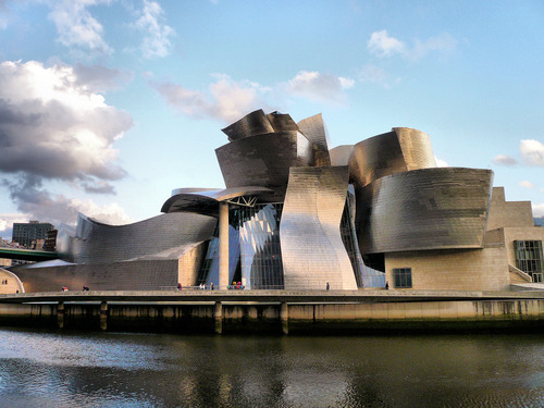
The Guggenheim Bilbao
The Guggenheim Bilbao by Frank Gehry

The Guggenheim Museum was supposed to create a new image of the city in an effort to attract development. Since the city’s decisions did attract this outside development, it is now deemed successful. When people visit the Guggenheim Museum in Bilbao they leave in awe of Frank Gehry’s Decontructivist work, but are they fascinated by the city and the people of Bilbao? In fact, in Chicago, you can experience a piece of Bilbao at Frank Gehry’s Pritzker Pavilion. Ironic. Or you can go to the Walt Disney Concert Hall in Los Angeles and experience Bilbao. In the end, are all these little pieces of Bilbao spread throughout the world, in fact, pieces of the brand of Gehry?

Image links:

Seattle’s Space Needle: http://www.visitingdc.com/picture/seattle-skyline-picture.asp

D.C. :  http://blogs.state.gov/index.php/site/entry/young_legislative_fellows_dc

Guggenheim: http://www.guggenheim.org/bilbao
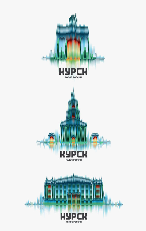
Vladimir: Transforming Russia, One City at a Time: Khramov

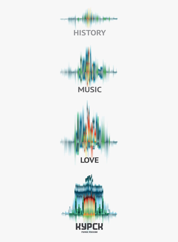
Kursk
Kursk: Case One

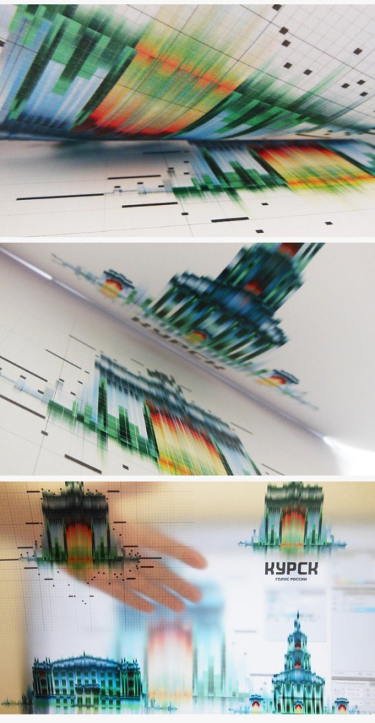
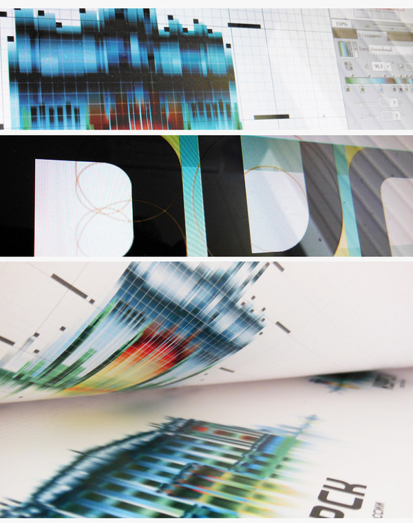
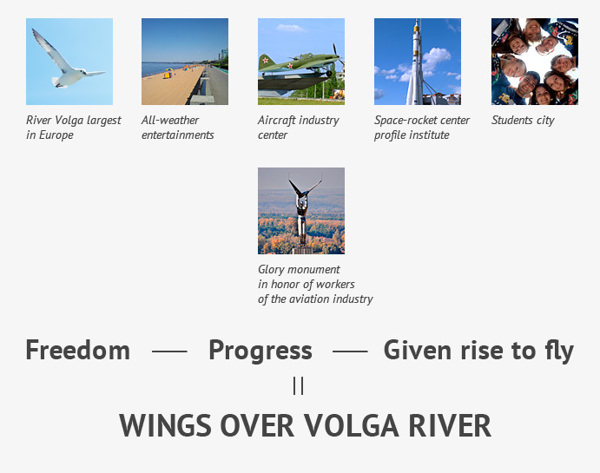
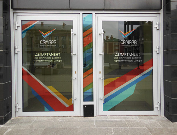
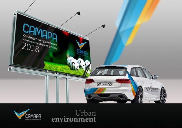
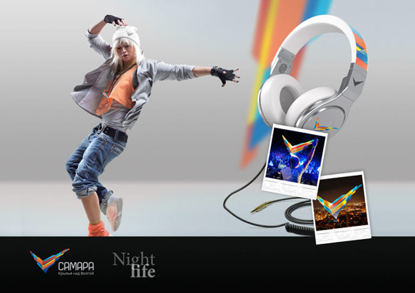
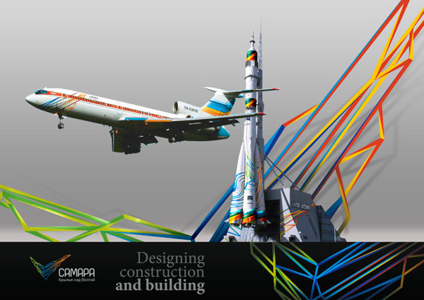
From the city of Samara in Russia, Vladimir Khramov has set himself and his studio Stilistica.ru ahead of the curve with its positioning of cities. Bridging the gaps between graphic design and architecture to create unique and powerful brands, Vladimir’s work is about the experience of form. We are confronted with a city’s physicality in his work as well as its unique story, a rare experience, but one often felt when visiting an urban area. Vladimir’s thoughtful exploration of line, texture, and dimension gives a viewer the chance to experience not just a city but also the history of a place through space in the form of a marque and its range of applications. Keep a close eye on Vladimir and his work as it is representative of something new and something distinctly Russian. In today’s global world, Russia is a powerhouse of design, music, and luxury. Branding happens here. Russia is repositioning itself not just as a place and culture, but also in the world of design. Vladimir’s work provides beautiful evidence of this fact.

Kursk Applications
Kursk Applications
Kursk Progression
Kursk Progression
Kursk: Progression
Kursk: Progression

Another Body of Work for Kursk.

Kursk Case Two
Kursk Case Two

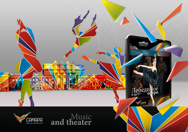
For the city of Samara.

Samara: Explanations
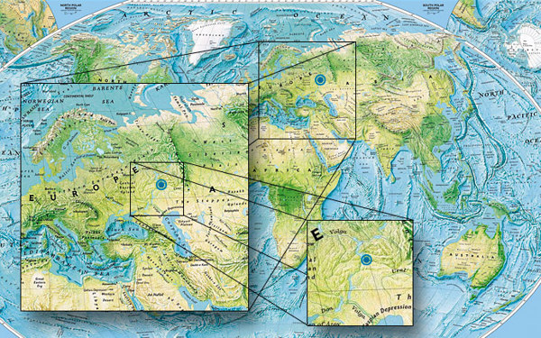
Samara: Map
Samara: Map
Samara marque
Samara marque
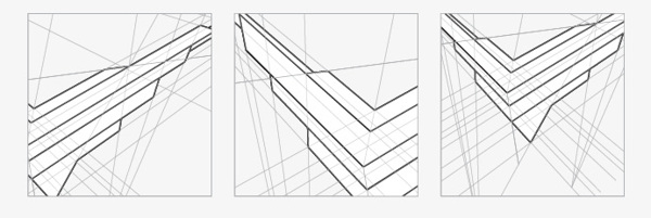
Studies
Studies
Samara Brand
Samara Brand
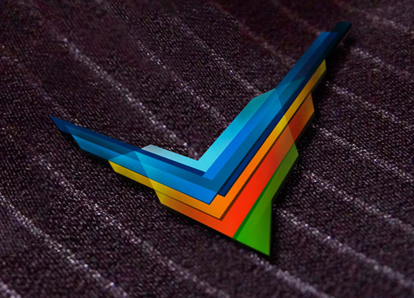
Brand Pin
Brand Pin
Marque Variations
Marque Variations
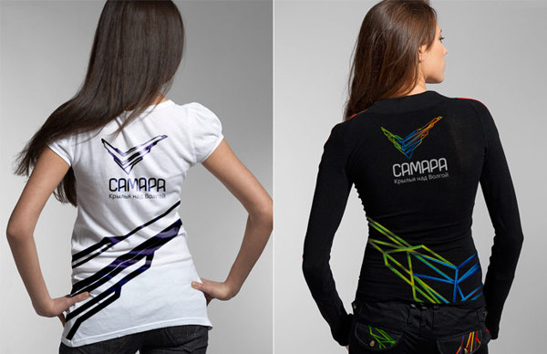
Samara shirts
Samara shirts
Marque Application
Marque Application
Samara applications
Samara applications
Samara Application
Samara Application
Samara at Night
Samara at Night
Samara Buildings, Travel
Samara Theatre and Arts

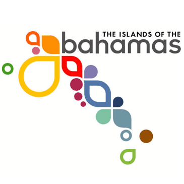
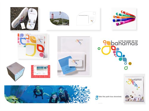
The Bahamas c/o Duffy & Partners & Co.

Bahamas Marque
Bringing Together Distance and Diversity through Design

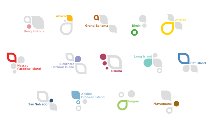
“Every island in the Bahamas needed to be represented and their independent personalities expressed within the overall message. The graphic design solution of the Bahamas identity was the foundation that brought the Bahamian islands a common message that could be broken into differential parts as needed.”

–Bart Cleveland, Adage.com

In 2008, I had the uncommon experience of seeing and meeting the indubitable Mr. Duffy for the first time as a student at SCAD. I watched his presentation, listened to his thoughtful careful words and viewed his breathtaking work with hungry eyes. This chapter meeting of the AIGA in Jacksonville was what graphic design was supposed to be all about. But what was this word ‘branding’? What did it take to ‘brand’ an island chain as disparate and uncommon as the Bahamas? There were so many of them. They all had their own unique characteristics, culture, music, food. And yet, they were all politically and economically connected. Much like any other place. Is it even possible to ‘brand’ something as ephemeral and meaning-packed as a place?

Duffy and Partners work, in cooperation with Fallon Worldwide, raises many questions about place. How do we define ourselves as part of a nation? Can we describe the process of what it takes to become a Floridian, an Ohioan, a Cincinnatian, a New Yorker, a Madrider, a Havanite? What do these places mean to us? What does it mean to grow up there? To eat there every day? To work there? To sleep there?

Think on all these questions and then attempt to think about how the people in the city 50 miles away might answer them. How are they related? Is there some common or shared experience? Now think if this place, this city were an island separated by many dozens of miles of water. These are not just tangible, physical challenges, but problems of identity and boundary, politic and economy. These are the things that make us similar and at the same time, make us alike as humans. The best solution is part of Duffy’s holistic approach to branding. Go there. Meet the people. Listen to them. Allow them to provide the solutions. Allow the work to flow from what they say, what they do, how they do it, and who they are as people and citizens and brand ‘partners.’

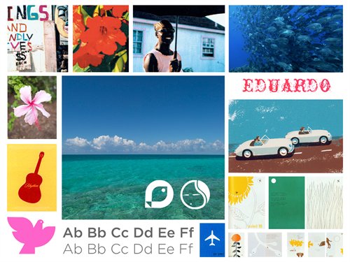
Setting the mood of the Bahamas

In commercial art, we are often presented with a client and a communication problem whose undertaking may seem impossible. Bringing together so many islands in the Bahamas might have seemed that way on first glance. Patience and the open minds of thinking designers proved different. Here is some of the evidence. However, I highly recommend Duffy’s Book, A Brand Apart, for a more complete and wholesome elucidation.

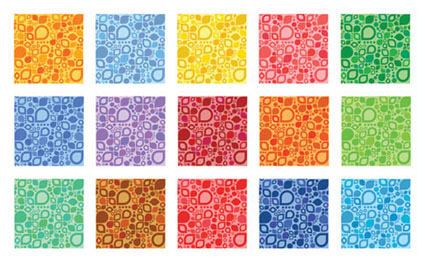
Bahamas Patterns
Bahamas Patterns
Range of Materials
Range of Bahamas Materials
Full range of islands

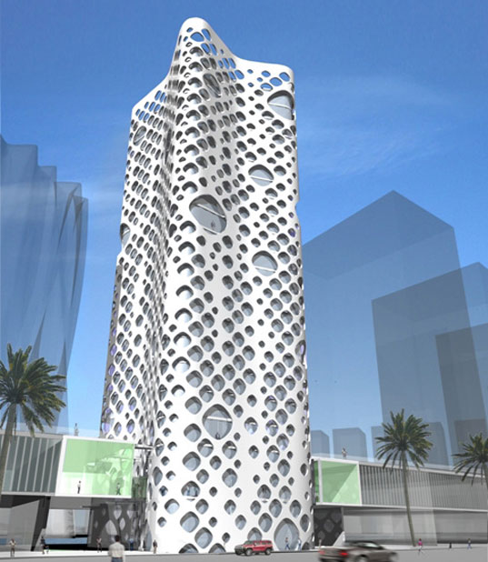
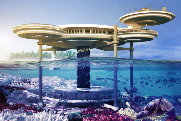
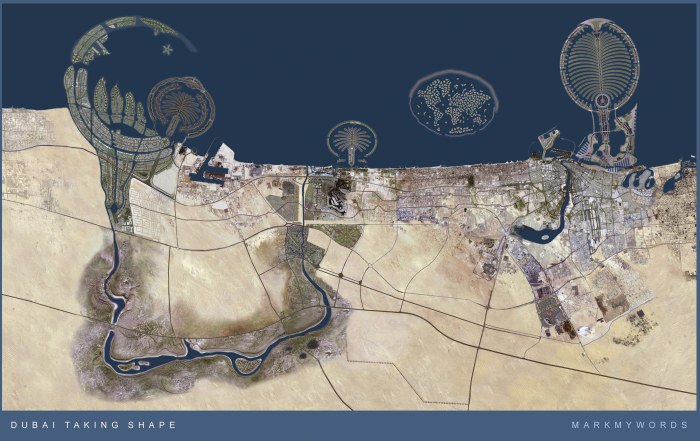
Dubai: Space is Place

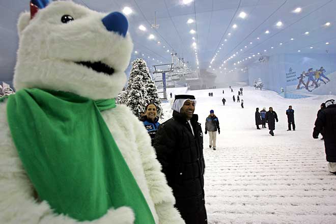
Dubai-Ski
Dubai-Ski – Polar Bear of the Desert

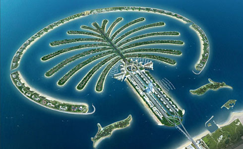
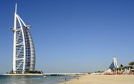
Dubai. Everyone knows its iconic buildings. Most have seen the transformations done to the physical topography. Many know the names of hotels there though they might not have been. Perhaps Dubai is itself the brand. The first city of its kind, born in an era of sophisticated branding and communication techniques the likes of which the world hadn’t yet seen. Taking the ideas Las Vegas has made popular in accounts like Thompson’s Fear and Loathing to a level that could make Buckminster Fuller and Salvador Dali blush together and hold hands–Dubai is perhaps the world’s only complete example of ‘place as brand.’ The region was created for a singular, commercial, and opulent purpose. The architecture speaks for itself in this Emirate of Dubai. The buildings are perhaps the only ‘brand’ the city will ever need. In today’s day and age, it might be more prudent to think forward in this fashion since the days of Rand’s 50-year logos are dead and gone. Though the bubble might have burst for now is Dubai, a brand? Or a place?

The Palm
The Palm
Dubai
Dubai
Koju Trading
The rich calligraphy of Koju Trading
Pharco
Pharco
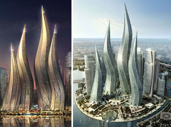
Dubai Towers
Dubai Towers
Dubai Tourism
Dubai Tourism
Dubai World Central
Dubai World Central
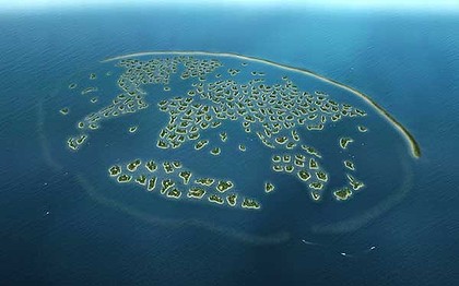
The World
The World
Dubai Advertising Award
Dubai Trade
Dubai Trade
Burj Al Arab Hotel
Burj Al Arab Hotel
Dubai Caledonian Society
A marque for the Scottish in Dubai
Avari_Dubai_Hotel
Avari_Dubai_Hotel
Dubai First
Dubai First
Marques as Motion
Marques as Motion
Dubai Airports
Dubai Airports
Dubai Calendar
Dubai Calendar
Icon Hotel
Icon Hotel


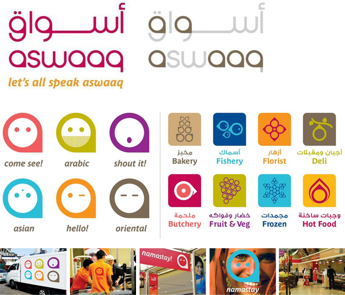
Aswaaq Supermarkets
Aswaaq Supermarkets
O-14 Commercial Tower
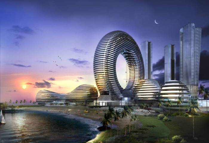
The Water Discus Hotel
Masterplan
Masterplan


100% Pure New Zealand

Pictures say 1000 words, especially when they move and sing.

Go to their YouTube Channel to immerse yourself in the experience of New Zealand and the work created. Something to keep in mind is not only the word New Zealand, but also the sophisticated and subtle use of the island as a punctuation mark in the 100% Pure New Zealand marque. The island chain becames an inescapable piece of the brand pie and is even seen in Somo’s distinctive Tourism Export Council marque. Though it doesn’t have the same brand power and punch as the 100% Pure New Zealand campaign, the form of the islands are too bold to ignore when working for anything tourist related.

Stay tuned for more New Zealand and after, more locational branding.

New Zealand and the Origins of Tourism Branding

The World Travel Awards recently voted New Zealand Australasia’s leading Tourist Board for the third year running. Its iconic 100% Pure New Zealand campaign will compete against the other regional winners from around the world on December 12th for World’s Strongest Brand. (See here for whole story.)

What most don’t know is that New Zealand is also responsible for the world’s first government tourist board with its Department of Tourist and Health Resorts, est. 1901. I recently ran into an article on these origins by Peter Alsop about his book, Selling the Dream: The Art of Early New Zealand Tourism. The author makes comparisons to the age of the Internet and globalism which highlight the bravery of what this great nation accomplished with its ‘Railway Studios.’ For the full synopsis and some of the author’s revelations, read this article from Idealog.

I not only learned something new today about New Zealand, but also have made the connection that for New Zealanders, tourism and branding are a way of life. The people are known for their hospitality and kindness as well as the scenic beauty of their island abode. It now makes sense to me that an incredibly sophisticated and tech-savvy industry has developed in this nation to bring those valuable economic boosters we call tourists. In this age of globalism and in the afternoon delight of the world traveler, New Zealand was once and remains today a positive force on the World Branding Stage.

More intriguing are some of the brands that spring up in New Zealand. Many fully embrace their physical origins. It is as if the entire nation retains this culture of branding and fully embraces it not only as a people but also as a resource for spreading the good word about their products and their nation. Stay tuned for more on this subject…

South African Tourism and Choices

On 5 November 2009, BizCommunity.com reported that South Africa’s Cabinet approved a new and official international marketing logo that would replace some 70 logos used in the past for the quickly rising nation.

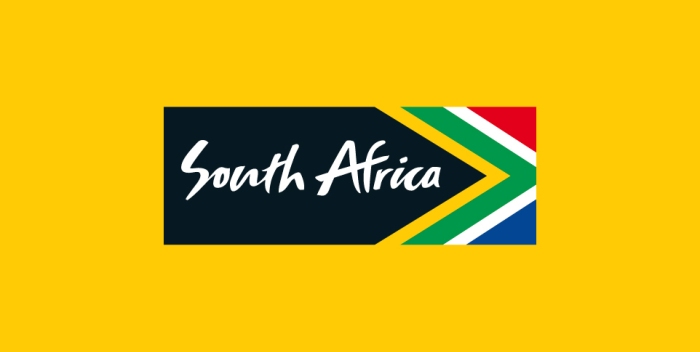
South Africa Marque designed by Grid Worldwide
Brand South Africa designed by Grid Worldwide

The importance of this marque to a nation is perhaps second to none in their preparation for the 2010 World Cup. But the execution, as seen on BizCommunity’s comment board, gets mixed reviews. Something else is present not in the work, but in the commentary itself.

As a designer, I feel the execution could have been better. There are certain things I enjoy about the marque. The directionality of the gestalt, the looseness of the typography, the iconic nature of the reference and deference to the flag and its colors and their meanings. (It is subtle, but this is not the actual flag. The geometry references the shape of the actual flag in a very sophisticated way, however.) It’s readable, it’s fun, and it performs the function of inciting people’s curiosity about a nation. The color palette specifically emphasizes the black which symbolizes the people of the nation, its most important resource and the best reason to visit any nation not your own.

Pick up any airline’s in-flight magazine, you might notice its fitting in nicely with other brands from around the world. It has that distinctive ‘this belongs here’ emotional quality to it that takes time to craft and requires engagement to initiate. And yet, it retains its distinction. Some of the commentary shows confusion

“Isn’t there a law that prohibits any writing on the flag? it looks good though.”

-energy guide

The execution is such a simple solution it gets confused for the historical flag. It is not. For a simple breakdown of the symbology of the flag read here… http://www.vexillologymatters.org/south-african-flag.htm

As for the execution, Eek says it best

“Its shockingly bad, even if it was OK, the placing of the ‘South Africa’ is too close to the left hand side and it shows absolutely no creativity, this is the first and most obvious solution!”

There is a paradox there. Sometimes, the first solution is the best. Think on the CitiBank logo and its now-famous napkin rendering. There is nothing wrong with finding something right the first time. It doesn’t happen often–but when and if it does–why would that decrease its inherent value? It’s communicative of a place and a people and the South African people’s elected representatives made a decision they were elected to make. Perhaps, in this case, we would be wise to look more closely at how design happens. It is not about one person, or even a small group of people and all their little combined idiosyncrasies. Design often occurs “by committee” and, Beirut’s “Poor, Lonely Obvious” is the proper solution.

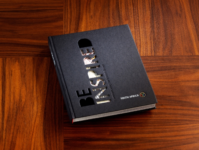
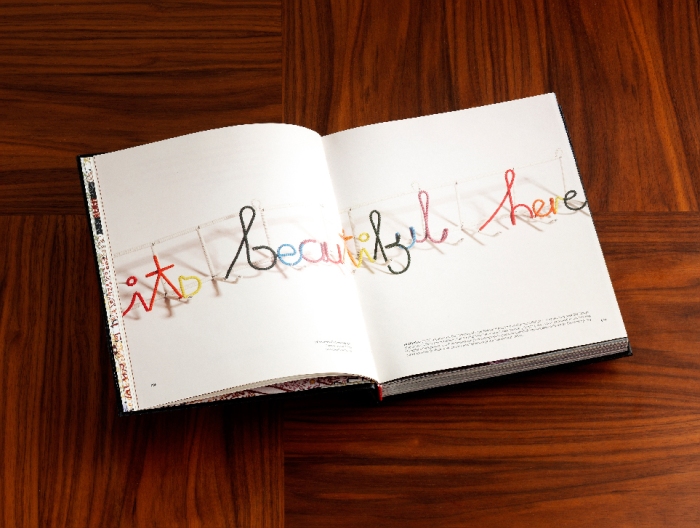
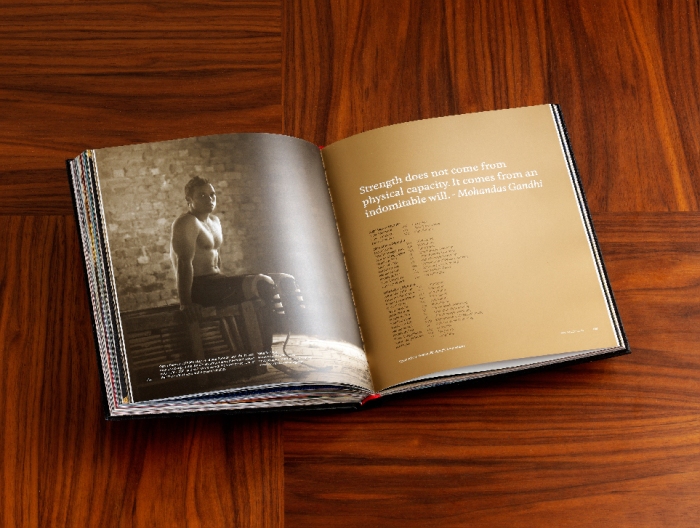
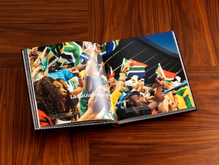
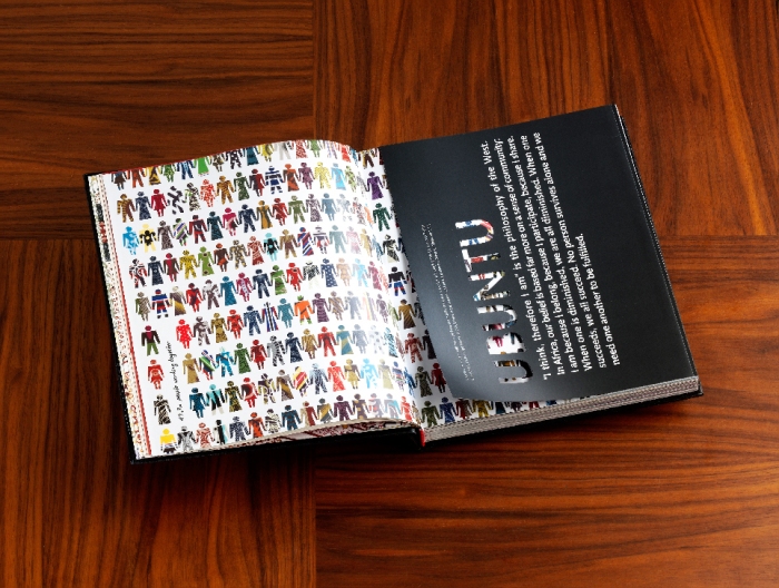
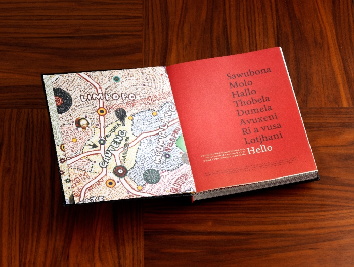
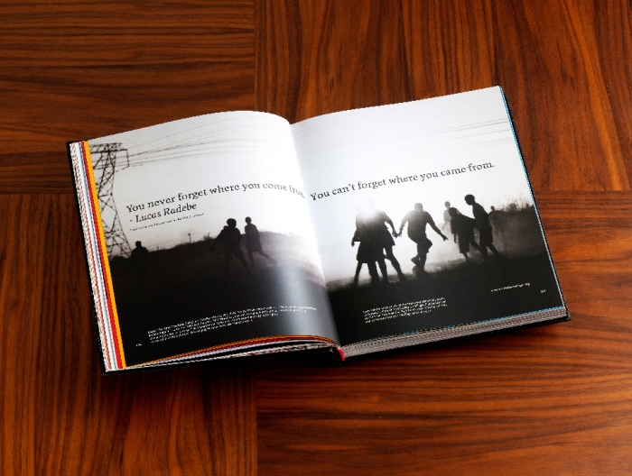
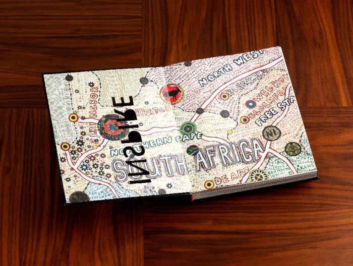
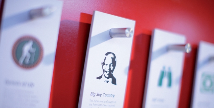
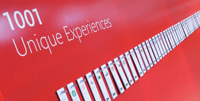
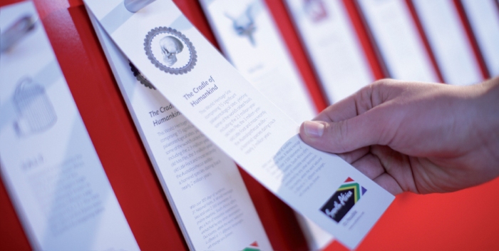
All controversy aside, the marque works as seen during the now famous World Cup 2010. The flexibility of the brand unfolds and now we have a narrative of “1,001 Unique Experiences.” This book is beautifully crafted with much hand-rendered typography, beautiful illustrations, stark photographs, and insight into the unique mythos surrounding some of South Africa’s heroes and artists.

"1001 unique experiences" by Grid Worldwide
“1001 unique experiences” by Grid Worldwide
"1001 unique experiences" by Grid Worldwide
“1001 unique experiences” by Grid Worldwide
"1001 unique experiences" by Grid Worldwide
“1001 unique experiences” by Grid Worldwide
"1001 unique experiences" by Grid Worldwide
“1001 unique experiences” by Grid Worldwide
"1001 unique experiences" by Grid Worldwide
“1001 unique experiences” by Grid Worldwide
"1001 unique experiences" by Grid Worldwide
“1001 unique experiences” by Grid Worldwide
"1001 unique experiences" by Grid Worldwide
“1001 unique experiences” by Grid Worldwide
"1001 unique experiences" by Grid Worldwide
“1001 unique experiences” by Grid Worldwide
"1001 unique experiences" by Grid Worldwide
“1001 unique experiences” by Grid Worldwide
"1001 unique experiences" by Grid Worldwide
“1001 unique experiences” by Grid Worldwide
"1001 unique experiences" by Grid Worldwide
“1001 unique experiences” by Grid Worldwide

The people here as with the color black in the marque play a starring role again. Through simple ideation, Grid Worldwide fleshes out a concept not easily rendered. But now I am confused, both as a designer and a simple viewer. The bottom right of the book displays another marque. Bolder, more textural, more dimensional, but still representative of both South Africa as a nation and its myriad peoples.

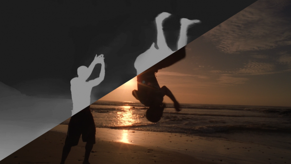
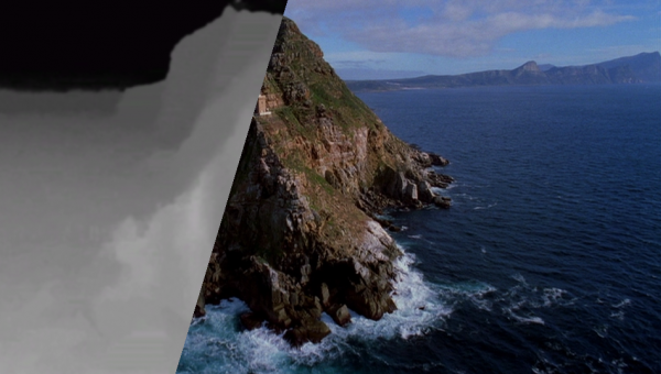
End Frame of commercial by Inition
End Frame of commercial converted to 3d by Inition

We now have choices as a viewer, a strange and disconcerting thought in the land of Nike, FedEx, and the NFL. This gives the identity a specific flexibility that translates across multiple mediums as seen in the work of Inition, here.

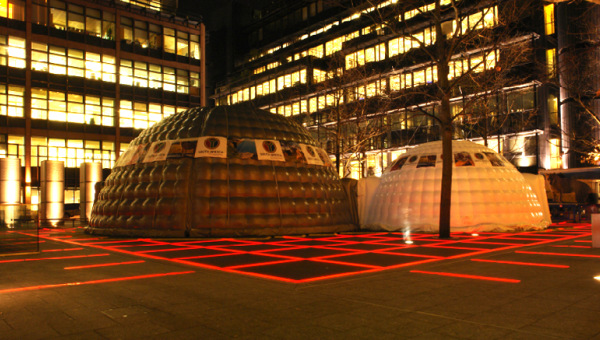
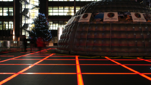
Specially commissioned geodesic dome in London's Broadgate circus.
Specially commissioned geodesic dome in London’s Broadgate circus.
Specially commissioned geodesic dome in London's Broadgate circus.
Specially commissioned geodesic dome in London’s Broadgate circus.
Specially commissioned geodesic dome in London's Broadgate circus.
Specially commissioned geodesic dome in London’s Broadgate circus.
specially commissioned geodesic dome in London's Broadgate circus
Specially commissioned geodesic dome in London’s Broadgate circus.

Note the beads of geodesic dome referencing the beads of the marque at the end of the 3 minute commercial. Though Inition was responsible for bringing the commercial to the 3rd Dimension in video, the additional brand experience of being surrounded by the ‘beads’ of the South African people and the essence of their video adds another layer of brand inception.

Love it or hate it, I have more friends that have been to South Africa than to London. Perhaps this is the true test of a brand’s strength. Regardless of the logo, I want to visit South Africa. Perhaps it is a sign of our times that brands–especially for nations–will become more and more simplified as individuals making travel decisions move away from the travel agent and into their own research. At times it may seem branding goes over the top, but for the people of South Africa and their rich culture and resources, no dome goes unturned.

All work © Grid Worldwide, 2012. For an exciting look into the conversion of video from 2d into 3d, check out Inition in the UK and their exciting work.

The Graceful Teaknique of Ekawit Lekviriyakul

Sainam I
Sainam I

Bangkok Metropolis, Thailand   FOLLOW HIM

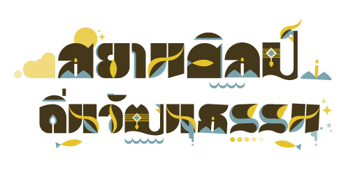
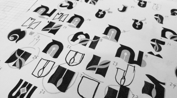
These lively and quiet, but illustrative forms were designed to express the nature of the people of Thailand and their waterside lifestyle. The color palette simply uses three organic qualities of the physical environment that flow through the blood and daily lives of the Thai people. All these forms and their animations seem to trickle around the idea of more than just a place and grow into the idea of a people. The Na’vi in Avatar come to mind with their deep-rooted connections to nature and their very real physical and spiritual world.

Wood, Water, Belief
Structure, Transit, Glue
Sainam
Sainam

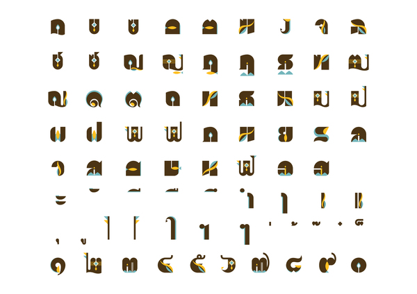
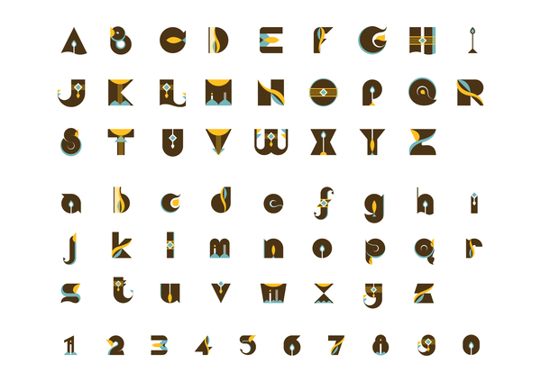
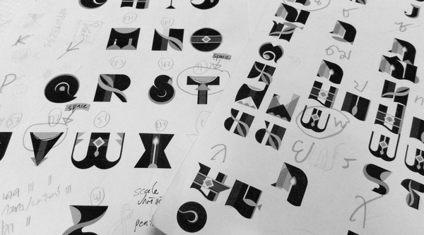
The baseline of the typeface references the water, a surface to travel upon and live life within. The glyphs are the Thai people themselves, above the water, but in constant interaction with its surface. Each glyph and its corresponding motion design brings the form and lifestyle of the Thai people into a pleasing resolution. Even the layperson, ignorant of the meaning and subtlety of the beautiful Thai letter forms can appreciate their fluidity and grace as they move. Though the two-dimensional representation of these aspects of Thailand may have been enough, the animation takes the project to another communicative level, increasing our understanding gently, almost musically. The third dimension comes with ease and in turn, increases our grasp of a specific meaning and a unique people.

Thai Glyphs
Thai Glyphs
Latin Glyphs
Latin Glyphs

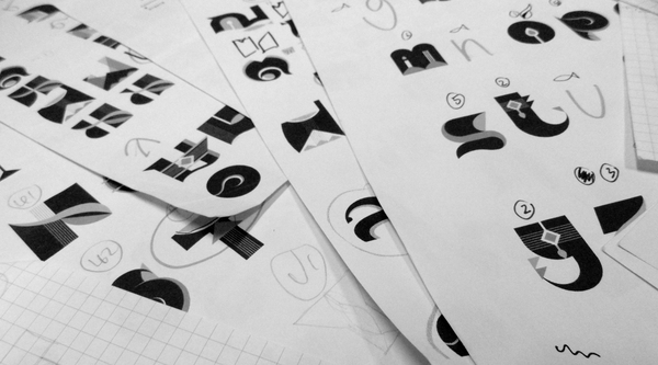
It was cogent of Ekawit to bring the Latin forms into this project for the student of design, but something else also happens here. We are confronted with the beauty and simplicity of letters as they are literally. These Latin forms in relation and contrast to the Thai again become ‘pictures.’ We see the primal hieroglyphs. We see language being formed in situ.

Nowadays, we read so much. Our current culture is incredibly inundated with the forms words take that we forget how they were formed. We forget the process. Ekawit’s rendering of this ‘new alphabet’ confronts us with the exotic while simultaneously bringing us into the familiar.

Sketches I
Sketches I
Sketches II
Sketches II
Sketches III
Sketches III

Ekawit’s sketches show a thoughtful process as well as potential for motion. The intimate breakdown of form and geometry is in step with his endgame. Ekawit’s studies and the final work highlight both a region and its beautiful people through letter form, but also bring into high definition the patient and time-consuming practice of the intensely intimate discipline of typography.

Please visit Ekawit’s site on Behance for the videos showing the animations of these beautiful type forms.

Transformative Geophysical Branding

from designboom
Image and marque by Wolff Olins

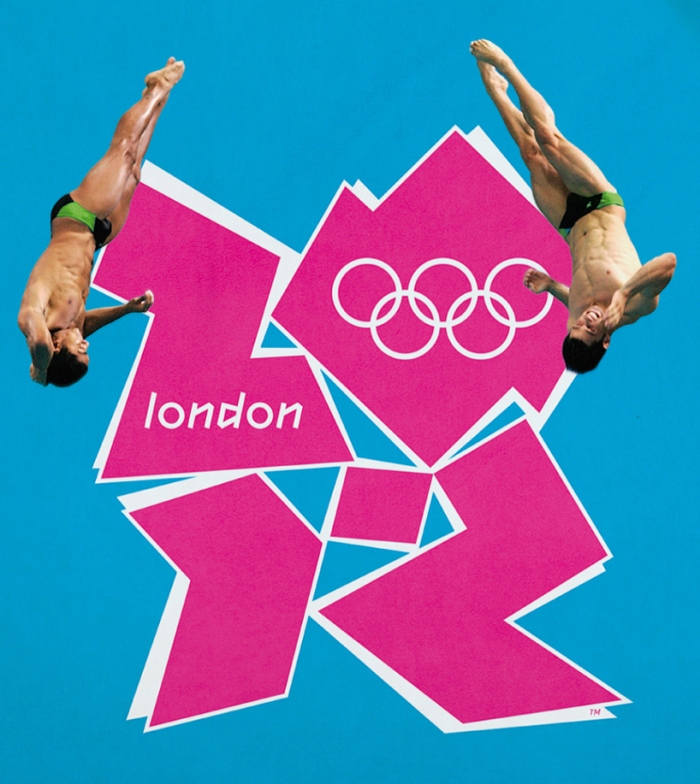
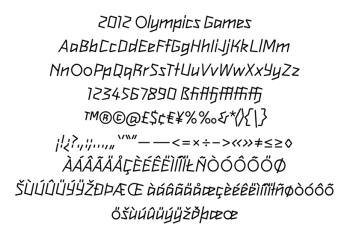
Transforming the ‘brand’ of a city might be something we’re not used to here in the States, but we are currently living in a global world. Every four years, at the Olympics we see excellent examples of some of the most in-depth and sophisticated systems of branding as seen very recently in London. Designboom covers it in-depth here and lists most of the major players. Design Boom’s post.

The logo, like or dislike, is instantly recognizable. The color palette is more relative to an age and a time then a specific city or place. It captures a spirit, a human energy seen every four years, no matter the region. And it uses the visual and typographic language of the region to express that energy, in context for the world to see.

from designboom
Variations from LOCOG

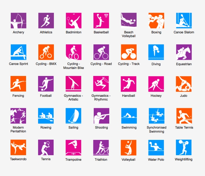
The simplicity of the typeface and its playful, bold energy works with the mark as well as the extensive and elaborate pictogram system. No impact is lost and the message is delivered uniformly without losing its punch. But the Olympics in London is perhaps one of the most visible examples of a new form of branding taking place constantly around the world.

from designboom
Typeface by Gareth Hague at Alias
from designboom
Pictograms by someone

My next few posts will highlight some exceptional examples of what I see as a new form, but what is already a valuable part of the rich visual cultures seen around the world. Though some of the work is a few years old now, the concepts are still fresh. Through the strategy of branding and visual thinking and forms of graphic design, we will see branding of a place and a space.