Five things that age well.
1. Acrylic paint left in the tube.
2. Wine in the cask or the bottle.
3. Scotch Whiskey in a barrel.
4. Honey, as it settles.
5. And lastly–but not leastly, as my girlfriend tells me–me. Happy Birthday to me.
Five things that age well.
1. Acrylic paint left in the tube.
2. Wine in the cask or the bottle.
3. Scotch Whiskey in a barrel.
4. Honey, as it settles.
5. And lastly–but not leastly, as my girlfriend tells me–me. Happy Birthday to me.
This is the first guest post on my blog. Recently, you might have noticed my series on the branding of spaces and places. I thought it fitting to have the perspective of a student of space weigh in here and offer some insights from someone less obsessed with the graphic articulation of complexity and more obsessed with the origins of much of that complexity. I have long been a fan of architecture, but still have much to learn. Thank you to Miss Bozzi over at fashioning architecture for her myriad perspectives and for being a constant source of inspiration. I hope to publish many more of our long evening discussions in the future as I find they keep me grounded and help me to find a balance. Enjoy and thanks again!
When Foster first started this branding series, I was inspired. And then he asked me to write a guest post about branding, specifically branding of cities/countries, from an architectural perspective, and I was honored.
Right off the bat without much research into the topic, I really question if architecture can be branding? Does architecture need to be branded? Why do we need logos and typefaces for cities if the space can brand itself?
But then on the other hand, ‘architectural branding’ has become the new buzzword of the architectural industry in the last decades and rightfully so, since architecture becomes an expression of the newly developed experiential brands. Despite our increasingly virtual world, we still need physical buildings to establish personal relationships with brands and architecture plays a vital role in this equation by not only confining customer experience, but defining it, which is more than any brand can do. I really question the ideology that architectural branding adds significant value. And I am still waiting for a good reason for why architecture itself can’t brand the cities.
Take a look at skylines. I think that you could probably guess which planning committees in the United States use their skyline as a branding form. In some cases the city skyline is a brand. When I look at the silhouette of Seattle, I know right away, “oh hey, that’s the space needle!” And when I see the Washington Monument peering up, I immediately think “oh hey, that is Washington D.C.!” The proof is in the pudding and the postcards.
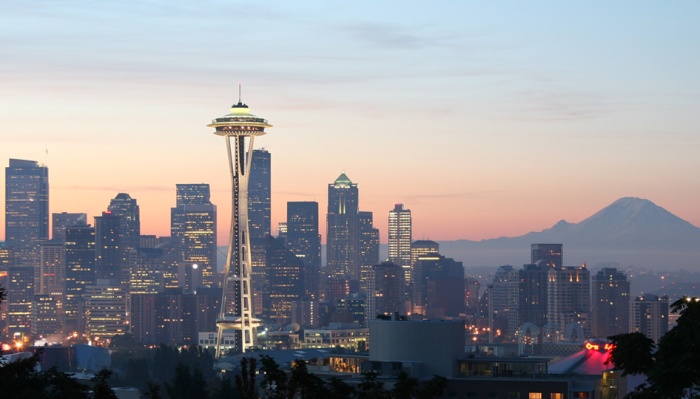

To be more critical, I really have to examine architecture at a human scale, not from the vantage of a hot air balloon. When you look at a downtown skyline, there is no sense of what the city really feels like, what culture is like, or the people who live there. What about cities that do not have a memorable skyline? What goes on their postcard?
I recently became fascinated with how the Guggenheim Museum in Bilbao was constructed as part of a revitalization effort for the city. It turns out that the Bilbao, as it has come to be known, has defined the new cultural position of the city because people come from all over the world to see Frank Gehry’s design. In a way, the museum has transformed the city and made way for gentrification in the surrounding areas. Although the success of this single piece of architecture constructed in a run-down environment is remarkable, I am left wondering what would Bilbao be like if Frank Gehry hadn’t been commissioned.
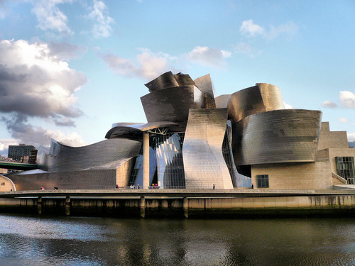
The Guggenheim Museum was supposed to create a new image of the city in an effort to attract development. Since the city’s decisions did attract this outside development, it is now deemed successful. When people visit the Guggenheim Museum in Bilbao they leave in awe of Frank Gehry’s Decontructivist work, but are they fascinated by the city and the people of Bilbao? In fact, in Chicago, you can experience a piece of Bilbao at Frank Gehry’s Pritzker Pavilion. Ironic. Or you can go to the Walt Disney Concert Hall in Los Angeles and experience Bilbao. In the end, are all these little pieces of Bilbao spread throughout the world, in fact, pieces of the brand of Gehry?
Image links:
Seattle’s Space Needle: http://www.visitingdc.com/picture/seattle-skyline-picture.asp
D.C. : http://blogs.state.gov/index.php/site/entry/young_legislative_fellows_dc
Guggenheim: http://www.guggenheim.org/bilbao
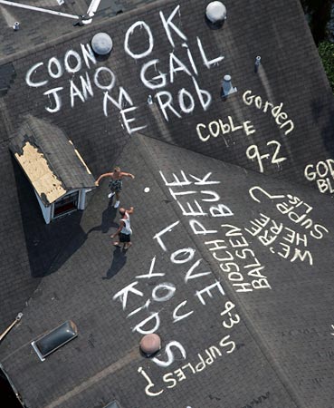
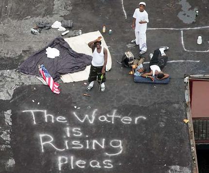

“It’s New Orleans. You’re Different Here.” Or are you? How does one ‘brand’ a place that has just been devastated? Where does it even start? Does the process of design or visual communication even matter at this scale of suffering? To the people of New Orleans–who depend on tourism after major economic shifts in the 50s and 70s–it does.
After the physical devastation of Hurricane Katrina, the ensuing media maelstrom resulted in a tarnish settling over the image of the South’s multi-faceted and multi-cultured gem. So the problem is then very specifically a branding one. The people of New Orleans and Louisiana would take care of the physical space. Peter Mayer Advertising would help handle the image with a multi-faceted campaign explained in part here.
Though this is not a full look at the incredible body of work Peter Mayer produced for its city it brings to mind some intriguing questions about the role branding places in defining place, or redefining it. Commercial art has not ever been shy about its role in manufacturing image. When combined with the discipline of design and the psychology of Peter Mayer’s public relations team, the city of New Orleans was beneficiary to a positive aspect of branding. A real physical city with real and tangible and hurting people needed real help to bring the tourism dollars back.
I have heard arguments on the impossibility of branding something as public and multi-variabled as a modern city. In this case, we see undeniable evidence of success. Though we in America will forever remember the travesty of Hurricane Katrina in 2005, some songs ultimately go unsung when things are being rebuilt. In this case, New Orleans is still standing and probably stronger than ever. The city’s people are survivors. The campaign to keep the economy going through tourism dollars was not only a success in branding, but also a shining example of the benefits of commercial art in our society.
I was privy to a lecture fully explaining this body of work through my local Pensacola Bay Area Advertising Federation. Though I understand the ethical implications of generating this type of work for something as ephemeral as a city and its people, it was an incredible experience to witness firsthand the effect the work could have. The potential for art and creative thinking to influence people around the world into visiting a specific region is no small task. It was a pleasure to more fully empathize with the reasoning behind attempting such a task, but also in grasping that ‘re-building’ a city is not always about plywood and nails. Our cities are complex. Keeping them going often requires complex systems of communication and influence that have a global reach. Who better to attempt this mammoth task than a local and passionate agency with Peter Mayer?
Follow their work here. They’ve grown with their city. What type of relationship do you have with yours?
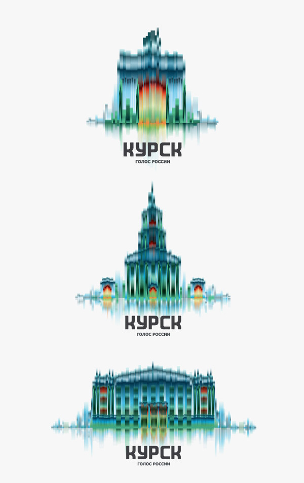
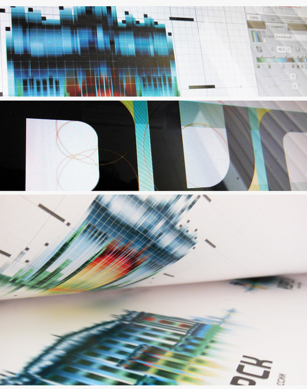
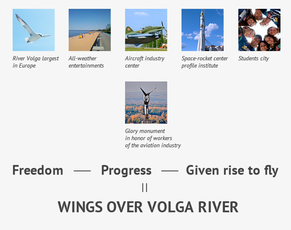
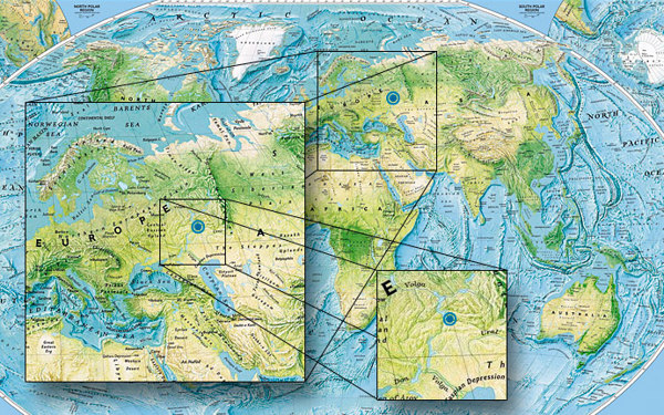
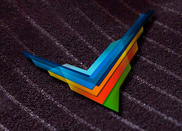
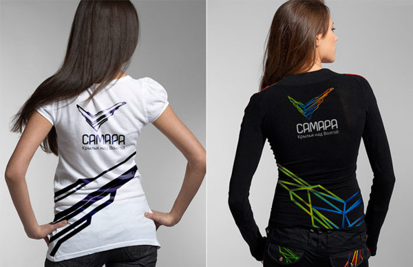
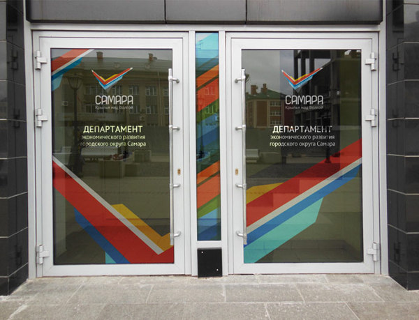
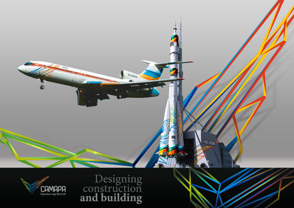
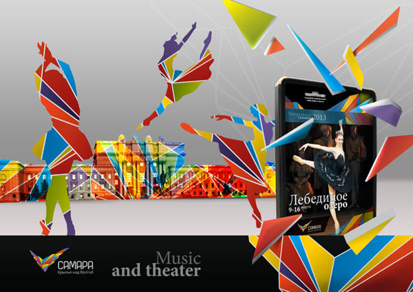
From the city of Samara in Russia, Vladimir Khramov has set himself and his studio Stilistica.ru ahead of the curve with its positioning of cities. Bridging the gaps between graphic design and architecture to create unique and powerful brands, Vladimir’s work is about the experience of form. We are confronted with a city’s physicality in his work as well as its unique story, a rare experience, but one often felt when visiting an urban area. Vladimir’s thoughtful exploration of line, texture, and dimension gives a viewer the chance to experience not just a city but also the history of a place through space in the form of a marque and its range of applications. Keep a close eye on Vladimir and his work as it is representative of something new and something distinctly Russian. In today’s global world, Russia is a powerhouse of design, music, and luxury. Branding happens here. Russia is repositioning itself not just as a place and culture, but also in the world of design. Vladimir’s work provides beautiful evidence of this fact.
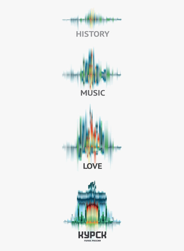
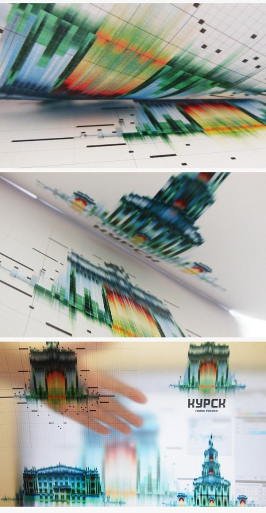
Another Body of Work for Kursk.

For the city of Samara.








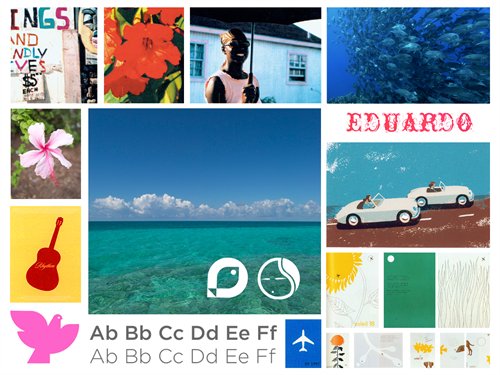
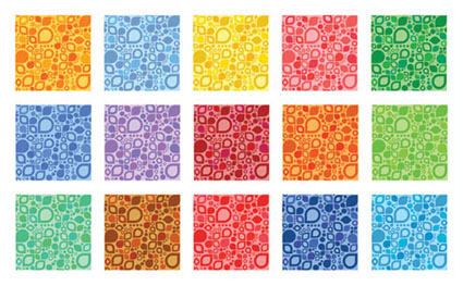
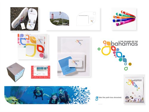
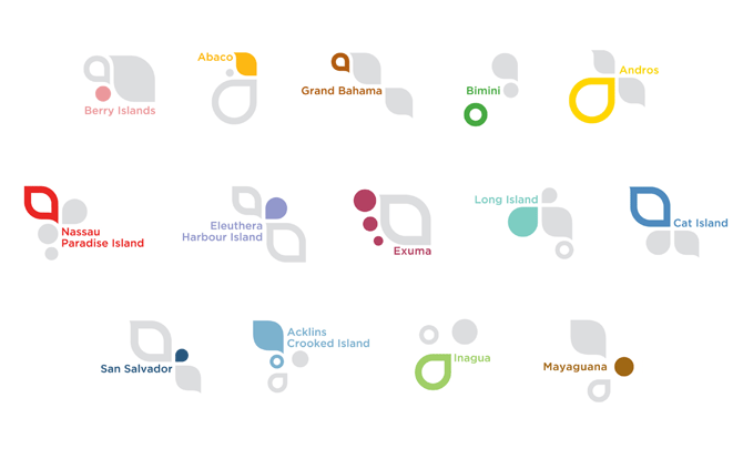
“Every island in the Bahamas needed to be represented and their independent personalities expressed within the overall message. The graphic design solution of the Bahamas identity was the foundation that brought the Bahamian islands a common message that could be broken into differential parts as needed.”
–Bart Cleveland, Adage.com
In 2008, I had the uncommon experience of seeing and meeting the indubitable Mr. Duffy for the first time as a student at SCAD. I watched his presentation, listened to his thoughtful careful words and viewed his breathtaking work with hungry eyes. This chapter meeting of the AIGA in Jacksonville was what graphic design was supposed to be all about. But what was this word ‘branding’? What did it take to ‘brand’ an island chain as disparate and uncommon as the Bahamas? There were so many of them. They all had their own unique characteristics, culture, music, food. And yet, they were all politically and economically connected. Much like any other place. Is it even possible to ‘brand’ something as ephemeral and meaning-packed as a place?
Duffy and Partners work, in cooperation with Fallon Worldwide, raises many questions about place. How do we define ourselves as part of a nation? Can we describe the process of what it takes to become a Floridian, an Ohioan, a Cincinnatian, a New Yorker, a Madrider, a Havanite? What do these places mean to us? What does it mean to grow up there? To eat there every day? To work there? To sleep there?
Think on all these questions and then attempt to think about how the people in the city 50 miles away might answer them. How are they related? Is there some common or shared experience? Now think if this place, this city were an island separated by many dozens of miles of water. These are not just tangible, physical challenges, but problems of identity and boundary, politic and economy. These are the things that make us similar and at the same time, make us alike as humans. The best solution is part of Duffy’s holistic approach to branding. Go there. Meet the people. Listen to them. Allow them to provide the solutions. Allow the work to flow from what they say, what they do, how they do it, and who they are as people and citizens and brand ‘partners.’
In commercial art, we are often presented with a client and a communication problem whose undertaking may seem impossible. Bringing together so many islands in the Bahamas might have seemed that way on first glance. Patience and the open minds of thinking designers proved different. Here is some of the evidence. However, I highly recommend Duffy’s Book, A Brand Apart, for a more complete and wholesome elucidation.

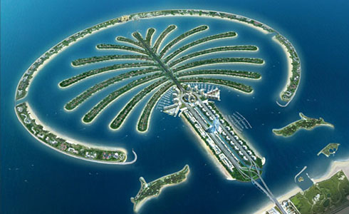
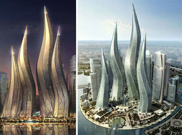
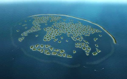
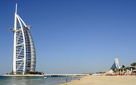
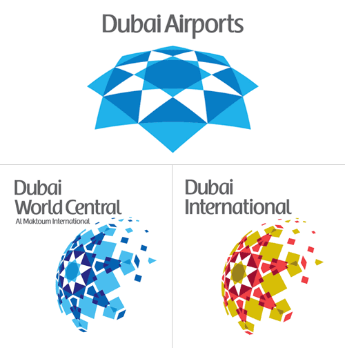
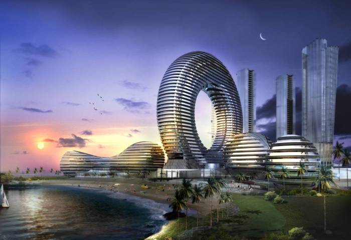
Dubai. Everyone knows its iconic buildings. Most have seen the transformations done to the physical topography. Many know the names of hotels there though they might not have been. Perhaps Dubai is itself the brand. The first city of its kind, born in an era of sophisticated branding and communication techniques the likes of which the world hadn’t yet seen. Taking the ideas Las Vegas has made popular in accounts like Thompson’s Fear and Loathing to a level that could make Buckminster Fuller and Salvador Dali blush together and hold hands–Dubai is perhaps the world’s only complete example of ‘place as brand.’ The region was created for a singular, commercial, and opulent purpose. The architecture speaks for itself in this Emirate of Dubai. The buildings are perhaps the only ‘brand’ the city will ever need. In today’s day and age, it might be more prudent to think forward in this fashion since the days of Rand’s 50-year logos are dead and gone. Though the bubble might have burst for now is Dubai, a brand? Or a place?










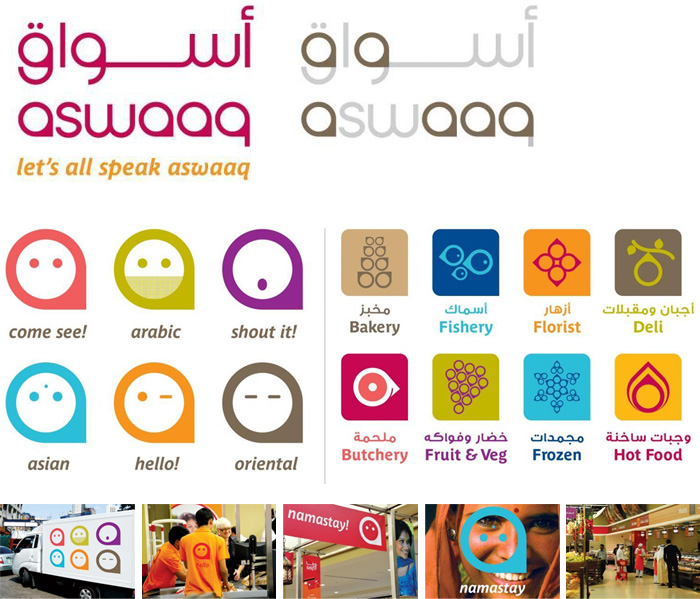
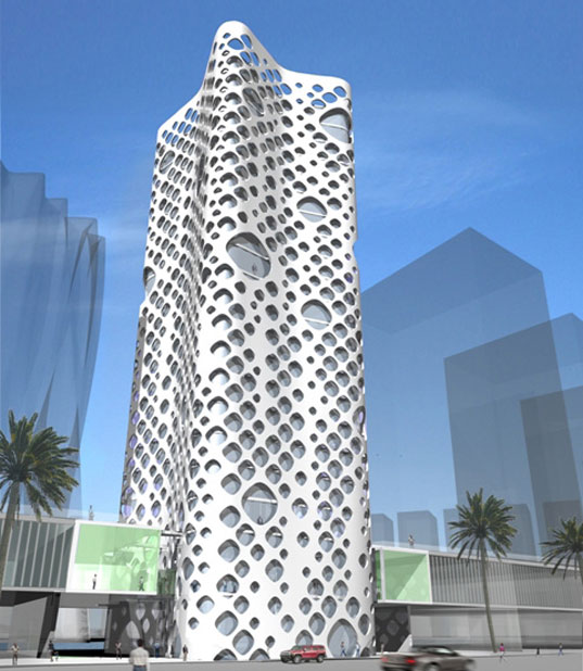
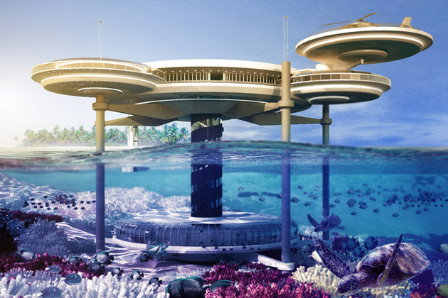
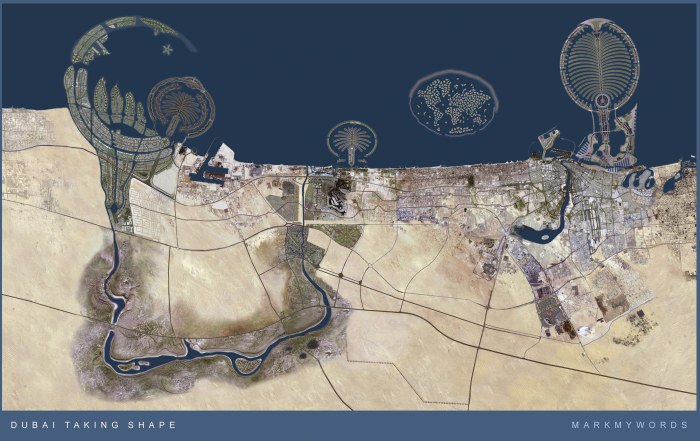
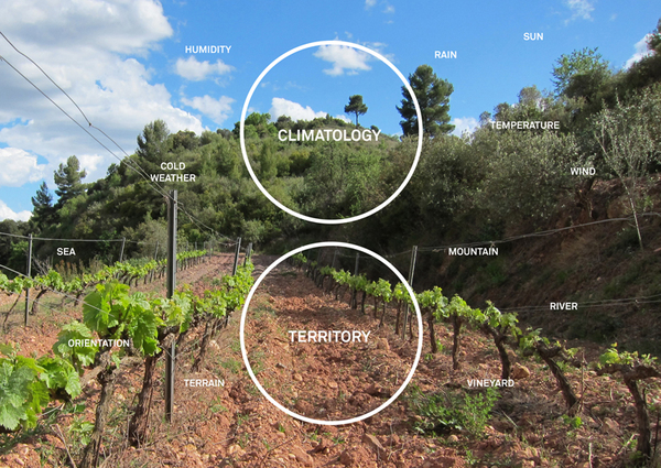
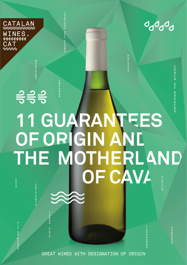
Anyone who knows wine understands the subtle complexities involved in not just the finished taste and final product, but also the extraordinary complexities of the craft. Throw in the extreme complexities of not just the geographical topography of a region that makes a specific wine, but also its inherent climactic patterns and characteristics, and we have the following work from Toormix.
This is a profound and perhaps unique version of branding a geophysical region because it isn’t just about a place. The place makes the product as do the people. The product, therefore isn’t just a crafted beverage. It is a place.
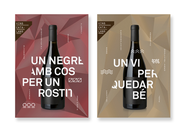
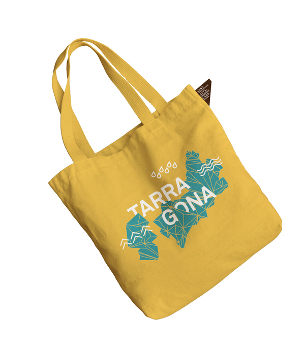
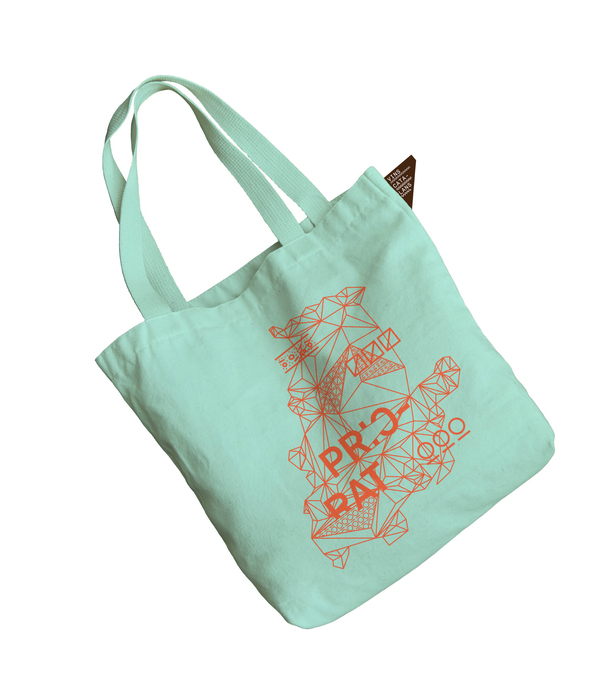
Toormix’s work is representative of perhaps one of the most sophisticated graphical treatments we’ve seen thus far. Not just for the visual complexity of the designs, but also for the necessity of a carefully crafted concept. There is a careful and gentle balance between chaos and rigid order present here rarely seen in good design, let alone, the usually fragile practice of wine packaging. The wines and their packaging from Catalonia will not only occupy shelf space, they will take it. Bringing together the varied disciplines of infographics, marque-making, pattern-building, cartography, and packaging, the consumer’s end experience is now a more educational one.
Though traditional wine packaging does not usually encompass all of these variables, Toormix’s work is representative of the thought and care branding deserves. Not only will a buyer of Catalan Wines know their vintage better, they will know the region.
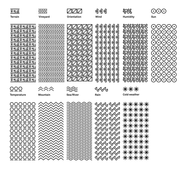
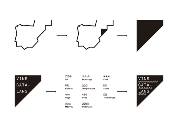
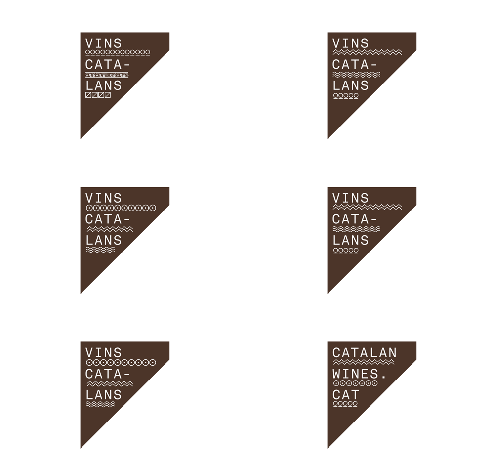
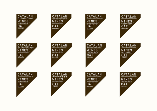
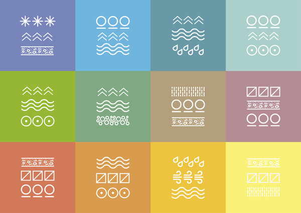
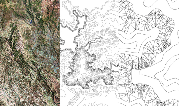
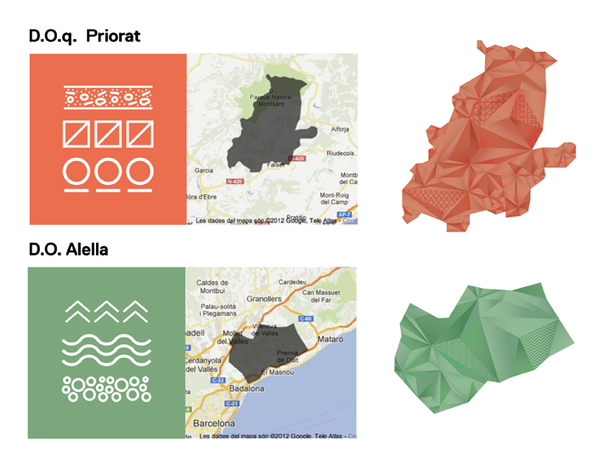
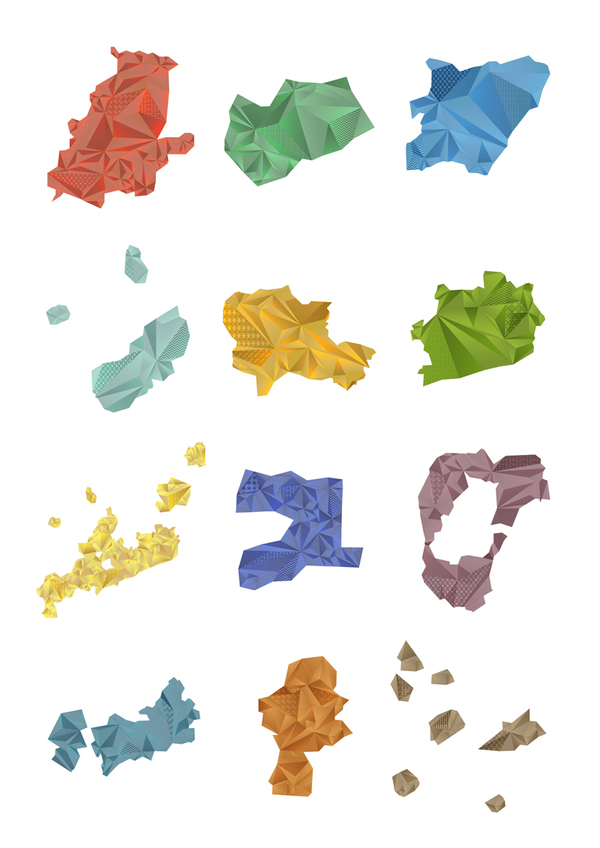
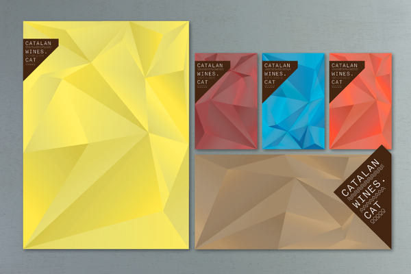
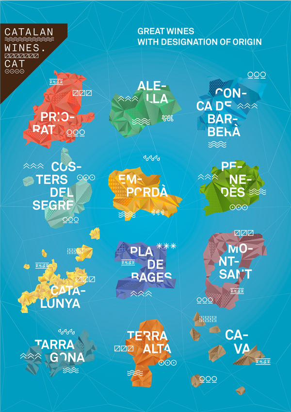
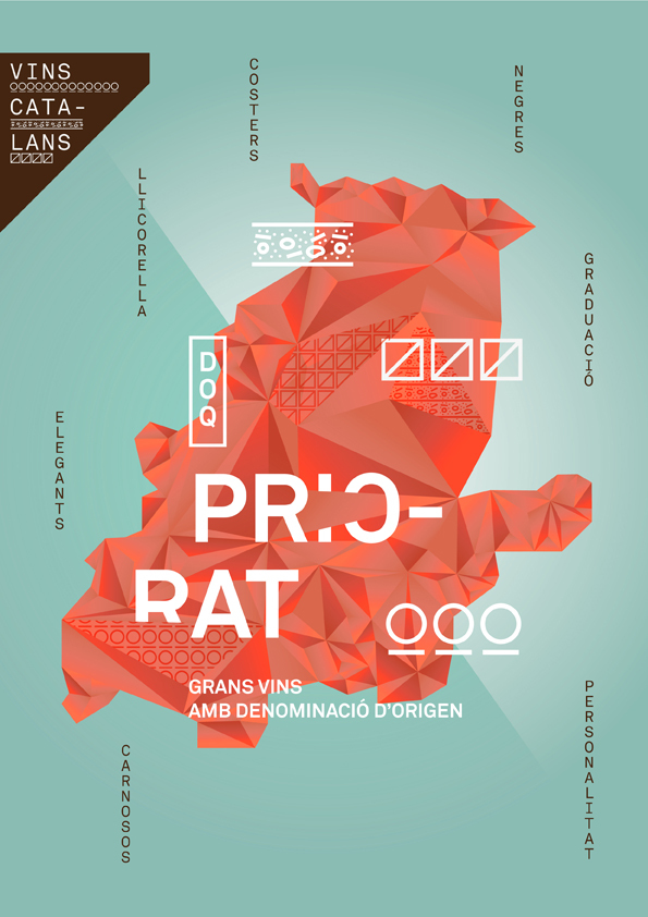
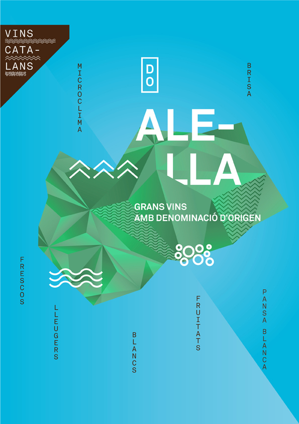
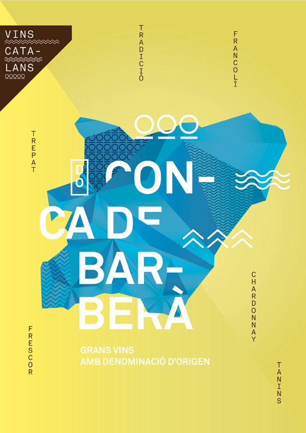
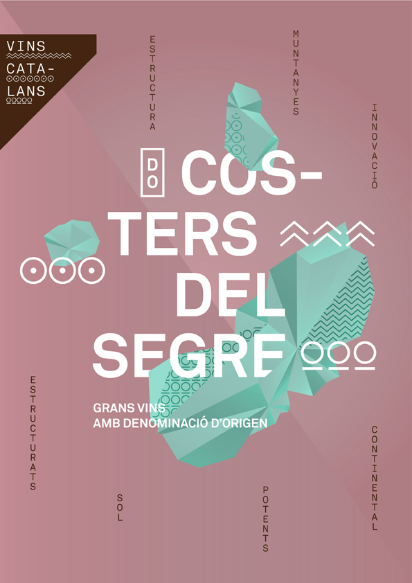
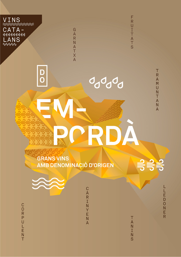
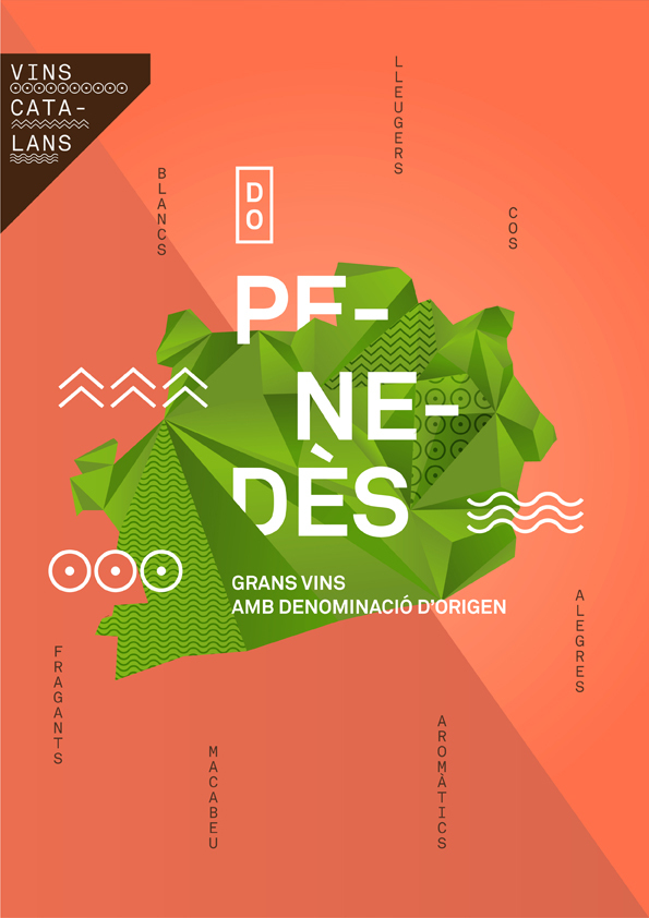
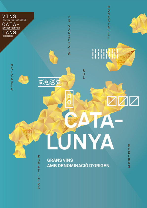
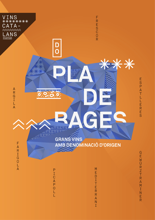
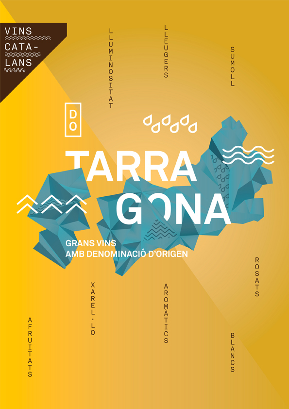
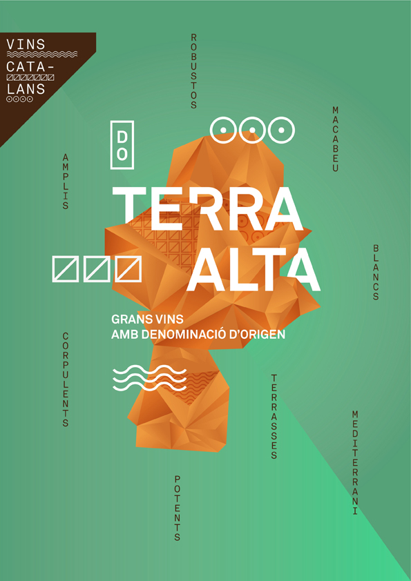
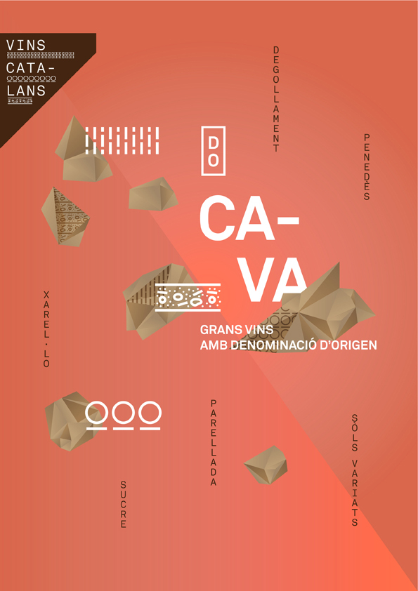
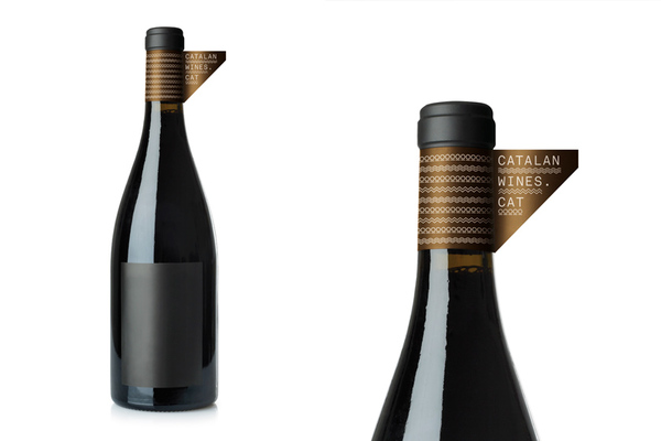
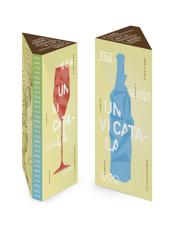
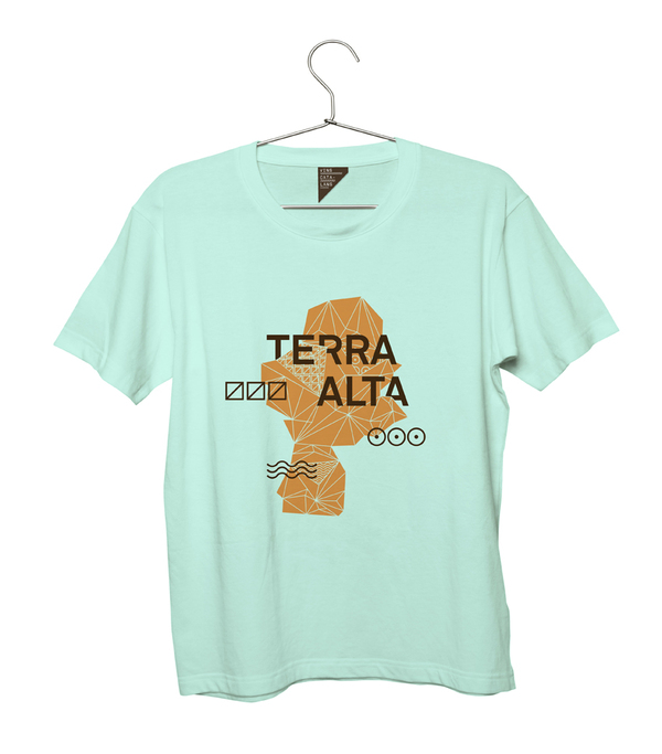
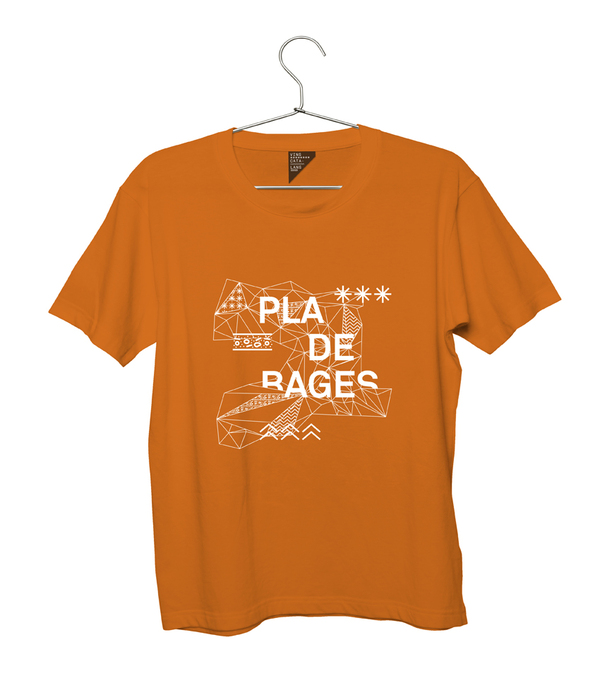
Please visit Toormix’s site to see other examples of their exceptional work. All work is © Toormix 2012. Imagery used with their permission.

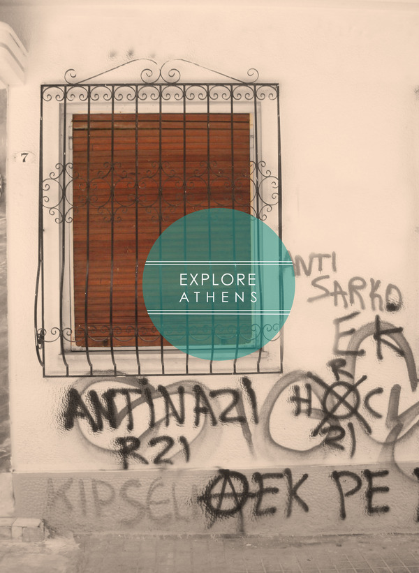
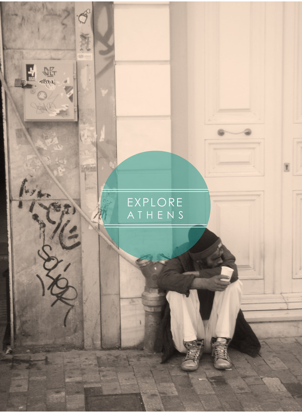
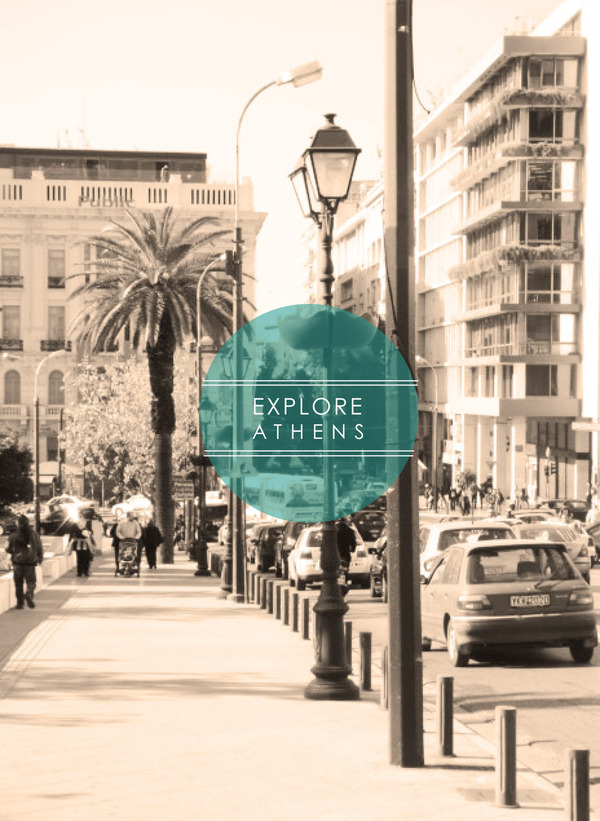
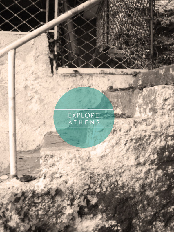
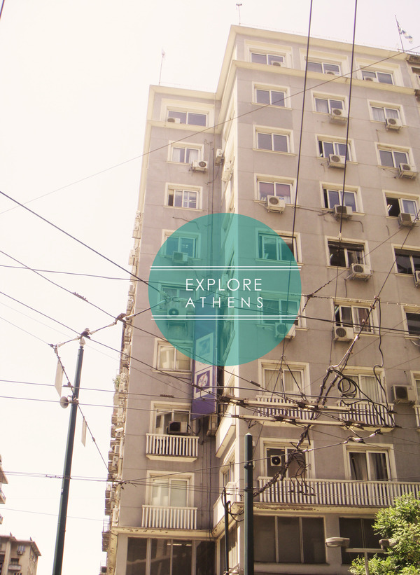
Sometimes all that is needed in branding is to document physicality, specifically for a city as rich in ancient texture and modern complexity as Athens. Using a simple type treatment and a photojournalistic-type array of photography, we see Athens as it exists. This is not Athens as imagined or as it could be. An excellent study not only in documentary photography, but also in simple design articulating complex concepts. Branding, but also the merger of two disciplines. The photographs show you. The type supplies the where. The circle has a subtle reference to Greek’s history and the geometry of its architecture. This bold distillation would perhaps not exist without the striking contrast of the real texture in Athens’ stones. Even the people, when present, seem made of stone and from a different time. Follow Vasiliki HERE.
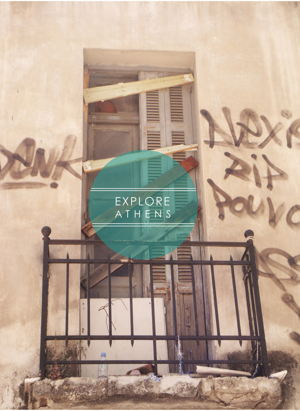

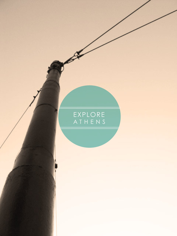

A fantastic collaboration between New Zealand On Screen, Chrometoaster, and Storybox, this marque and the accompanying graphics again fit into the overall scheme of products and services offered by New Zealand. Within the nation itself, there is a reverence for where they come from as a place and a simultaneous love of film. A few of my favorite things. Nation-branding, mixed typography, pixels, cargo containers, traveling exhibitions and celluloid. Visit Chrometoaster’s site for a study of the work.
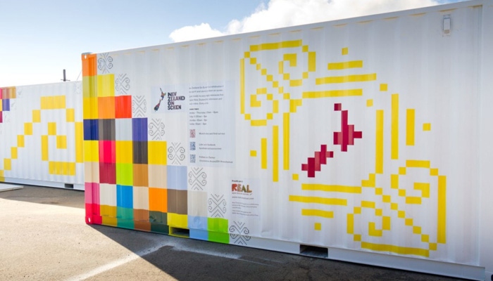
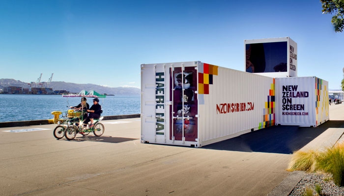
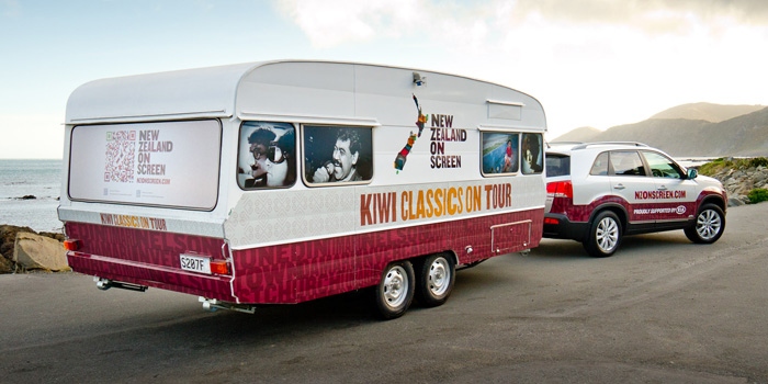
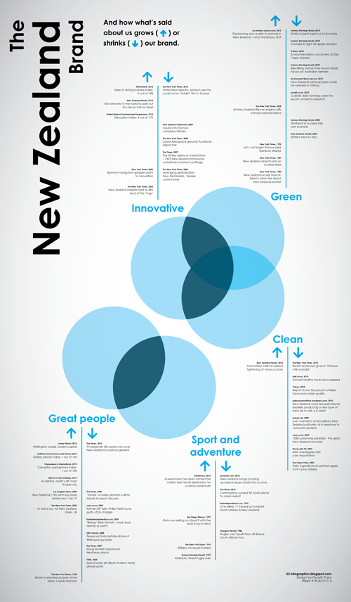
Follow him here. Notice the overall gestalt of the overlaps vaguely resembles the Kiwi archipelago.
